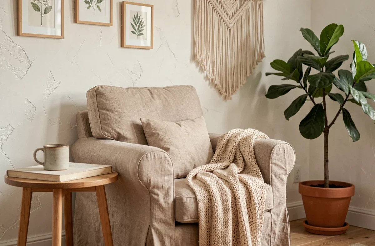
Creating a warm interior is about more than choosing a plush sofa and a few cushions. Several measurable factors—the color temperature of the lighting, paint emissions ratings, and the proportion of natural materials—shape how comfortable a room feels. This article reviews the practical criteria that distinguish a genuinely warm home interior from a simple collection of trendy objects.
Emissions labels and color temperature: two rarely compared interior design indicators
When it comes to interior ambiance, design guides cover colors, materials, and furniture. Yet two technical details are missing from most recommendations, even though they directly affect everyday comfort.
| Criterion | What it measures | Practical interior design guideline |
|---|---|---|
| Indoor air emissions label (A+ to C) | Level of volatile compounds emitted by paints, flooring, and adhesives | Always choose products rated A+ for the lowest emissions |
| Color temperature (Kelvin) | The light tone of a bulb, from warm white to cool white | Choose warm lighting in living rooms and bedrooms for a cozy atmosphere |
| Share of natural materials (wood, linen, wool) | Proportion of non-synthetic fibers or surfaces in the room | Combine unfinished wood and natural textiles for a warm look without visual clutter |
The first indicator is regulated: in France, construction and decorating products carry a label ranging from A+ to C. A living room painted with a C-rated product may release more pollutants than one finished with an A+ product, affecting respiratory comfort—especially in winter, when people tend to air out their homes less often.
The second indicator relates to the physics of light. A bulb that is too cool can undermine the cocooning effect of a wall in warm colors. Taking both factors into account alongside your choice of colors and materials helps create an interior that delivers on its promise, both visually and in terms of air quality.
Online resources already bring together approaches to visual comfort and material choices: the home section of Murmures Déco offers this kind of guidance focused on living spaces.
Living room color palettes and lighting: combinations that work
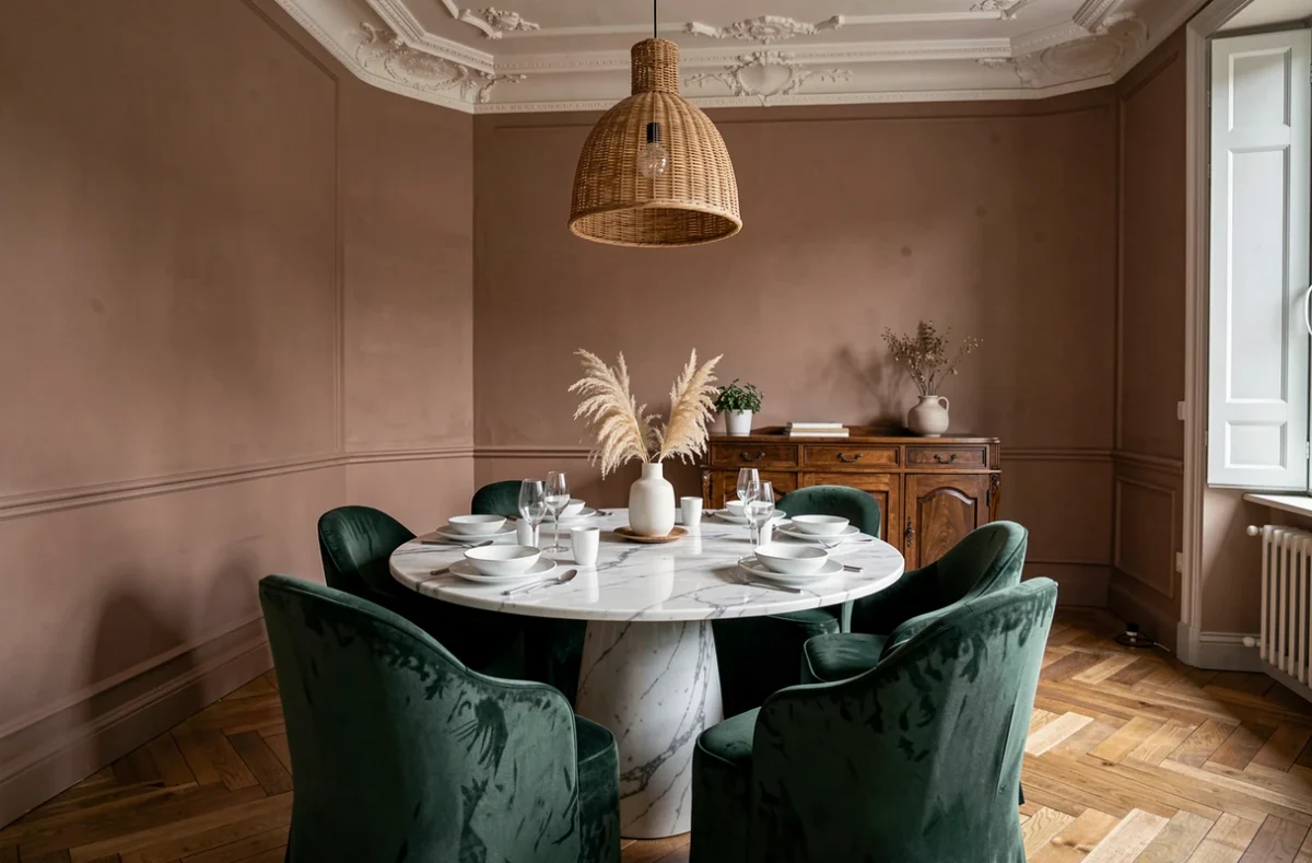
Coordinating wall colors with light sources remains a weak point in many interior design projects. A terracotta wall that looks stunning in a showroom under carefully calibrated lighting can turn a dull brown under a poorly chosen standard bulb.
Warm colors and soft lighting
Ochre, terracotta, and rosy beige absorb some of the light. They call for multiple accent lights: a table lamp, string lights, and candles. Several low-level light sources work better than a single ceiling fixture for bringing out the depth of these shades.
Take care with candles and incense: these mood-setting elements release particles and other pollutants. Airing out the room after use and limiting burn time help preserve air quality without sacrificing a warm atmosphere.
Neutral colors and natural light
Off-white, pearl gray, and sage green make the most of daylight. In a north-facing living room, a light-colored wall helps compensate for limited sunshine. Adding light wood (oak, beech) in furniture or shelving brings in the warmth that a cool palette cannot provide on its own.
Secondhand furniture in interior design: an underrated way to add character
ADEME notes that reuse and repurposing are growing in France, although the relevant sectors remain unevenly developed. This goes beyond a simple environmental argument: a vintage find brings a patina and individuality that no catalog can replicate.
Mixing a few secondhand pieces with a more neutral foundation creates visual contrast and gives a space character. An antique dresser in a contemporary living room, or a 1970s armchair opposite a modern linen sofa: the contrast creates harmony through tension, not uniformity.
- Check the structural condition of a reclaimed piece of furniture (legs, drawers, hinges) before bringing it in—the appearance alone is not enough, especially for load-bearing items such as shelves or console tables
- For older materials (beams, tiles, parquet flooring), make sure they have not been treated with potentially harmful substances before installation
- Pair one standout vintage find with understated furniture to avoid a flea-market look—one antique piece per room is enough to establish the style
Textiles and natural materials: build warmth in layers
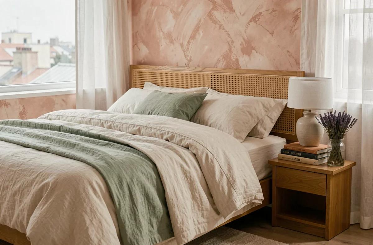
Synthetic materials (polyester, acrylic) mimic softness but do not regulate humidity or temperature the way linen, wool, and cotton do. When creating a warm interior, your choice of textiles matters as much as your choice of colors.
The principle of textile layering works through overlapping textures: a wool rug on the floor, a linen throw on the sofa, and cushions in heavyweight cotton. Each layer adds visual and tactile depth without crowding the space.
Wood plays a similar role on hard surfaces. A solid oak tabletop, a walnut frame, or pine shelves can warm up an interior even when the wall palette remains neutral. The key is to vary the wood species and finishes rather than use more of them.
Decorating mistakes that create clutter: when too much undermines harmony
Filling a living room with decorative objects makes it feel smaller and muddles the room’s visual flow. Three carefully chosen objects on a shelf have more impact than twelve knickknacks scattered around.
The practical test is simple: remove an object from the room for a week. If nobody notices, it was not adding anything. This less-is-more approach works for framed art, vases, plants, and textile accessories.
- Limit patterns to two per room (one geometric and one organic, for example) to avoid visual overload
- Leave at least one wall clear in every living space to give the eye room to rest
- Group small objects on a tray or plinth instead of scattering them across a piece of furniture
A harmonious interior depends less on what you add than on what you choose to leave out. Coherence comes from editing, not accumulation. Colors, lighting, and materials have the greatest impact when each element has enough room to stand out.